
Located in Indonesia, Sumba Mimpi Travel is a travel agency that focuses on eco-tourism and customised tours. The company's ethos are to help promote the island ecologically as well as help the local community by working with them. The client's brief was to keep the design simple and to reflect the island's culture. For this project the client needed a logo and a logo application guide.
|
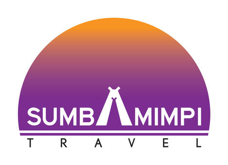
Having been to the island personally, I took to awe of the dawn and dusk hours where the sky puts on a spectacular display of colours. Often on many evenings the sky has hues of purple and orange. Taking this as inspiration, a gradient of orange and purple hues were used in logo. The 'A' in the logo is incorporated with the ever prominent, if not unique, rooftops of the traditional Sumbanese home that you'd come across on the island. This logo represents the beauty as well as the traditional aspect of the island the company is promoting. |
A simple logo application guide was created for their in-house design team to use as a guide.
|
|